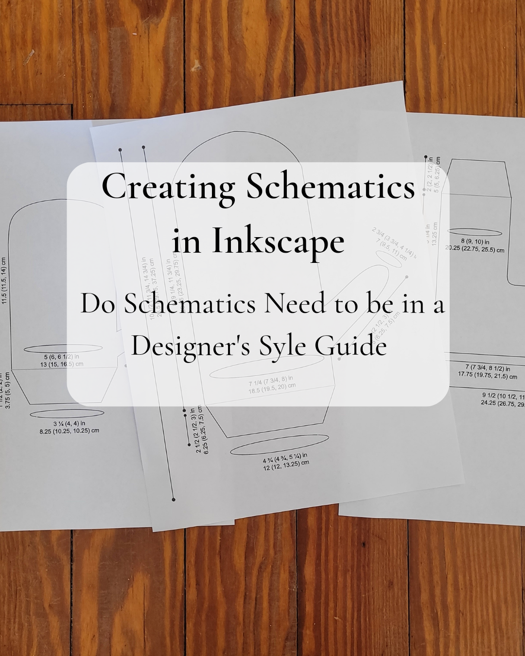
Style guides can be helpful in drawing schematics. Let me guide you through details to consider when drawing schematics for patterns.
Hello everyone!
As a style guide can help in organizing and formatting your patterns, a style guide can also include the details of how a schematic appears.
It can be a separate style guide or be integrated into a current style guide.
Having these guidelines for a schematic drawing will help present consistency and clarity in the final appearance and finished measurements of a schematic whether it is for a sweater or shawl.
Also, these guidelines will help all schematics created for a designer be uniform and unique from other designer’s schematics. A knitter will look at these schematics and witness a designer’s style shining through!
Keep in Mind
- I use Inkscape so I use names that are relatable to Inkscape. For example, stroke is the name given to the lines that create the outline of the schematic, texts, and more in Inkscape. A different software may use different terminology, but the thoughts concerning details to be aware of still apply.
- Play around with different aspects of schematic drawing to find what is appealing and practical when putting together a style guide.
- I’ve included my own style guide for schematics at the bottom of this article. I hope this will be helpful! ❤️
Here’s what I’ve found helpful to include in a style guide for schematics.
Stroke Appearance
- Width (How Thick or Thin)
- Straight, Dashed, or Dotted
- Endpoints or Not
How thick should the strokes be? Think of it like picking what thickness of Sharpie to draw with it. Am I going to have different stroke widths for the outline of your sweater or sock than the strokes within the outline that mark cuffs or raglan shaping?
For me, I use 0.5 mm stroke width throughout the entire schematic drawing.
Are all strokes going to be straight? Will I use dashed or dotted lines? Will any endpoints be used? There are so many options!
On my own schematics, I don’t use any dashed or dotted stokes. I’m plain and simple. Straight lines throughout the schematic are my jam! I will use end points on the lines that mark the straight measurements.
Color
- Color of Strokes
- Color Within Schematic Outline
What colors am I going to use for the schematic’s strokes? Will I stick with one color, or will I use different colors depending on the purpose of the stroke? Will I use color within my schematic drawing? I don’t have to pick one or a few colors and stick with them, but I want to be mindful of how color can attribute to visual harmony across schematics from various patterns.
Black is my color of choice for all strokes except those within the outline of the schematic which I use a gray. For example, I will use a gray Stroke to mark cuffs, shoulder shaping, or other details I want to showcase.
Marking Location of Measurements
- Marking Straight Measurements
- Marking Circumference Measurements
I use strokes with endpoints to mark the measurements that are straight like the length of a sock leg, cross back width of a sweater, etc.
I create ellipses to mark the measurements that are circumferences like busts, feet, and heads.
Text
- Font
- Size
- Color
- Width
- Picking Unit Measurements
Picking a clear font is very important! If a knitter can’t read the text of my schematic, which includes the crucial measurements, my schematic becomes more of a roadblock than aid to knitter’s following the pattern.
I use sans-serif font which has been documented to be a good font for even the visually impaired.
Size of text is also important to whether my text will be useful to others. Consider what text size is easy to read and yet fit well on the schematic drawing. I use 12 point for text.
In Inkscape, I have to verify the text’s stroke isn’t too wide. This can make the text look bold and difficult to read. If I’m working in a software, I need to make sure that other factors aren’t affecting the readability of the text.
Decide on what unit measurements to use on schematics. Ideally, I should use the same unit measurements that I use within my pattern to avoid confusion. For me, I use both inches and centimeters.
Consider if the unit measurements will be abbreviated or not. I use in and cm to save space in my drawing.
Conclusion
Are you a designer? Do you have a style guide for your pattern writing process? Does it include guidelines for schematic drawings? I would enjoy hearing your thoughts!
Have a blessed day, friends! I will be back with more to share soon.
Leave a Reply